
Monopoly Man Meets Pip-Boy
The original design inspiration for Marital Bliss was a mix of the classic monopoly man, and Pip-Boy cartoons from the Fallout game series.
We always wanted Martial Bliss to have a tongue-in-cheek, kitschy feel to it. Generally, I think when you hear “relationship game” the knee-jerk reaction is an eye-roll and an “Oh boy, this is going to be corny” expectation. So, we wanted to lean into it with some sort of idyllic, over-produced, happy-go-lucky style… because we all know marriages don’t actually work that way.
Also, I wanted the design to have a playfulness to it. Most games for couples take themselves seriously. They generally focus on heavy questions and relationship problem solving. That’s the core problem we were solving with Martial Bliss: most couples games lack a sense of “fun.”
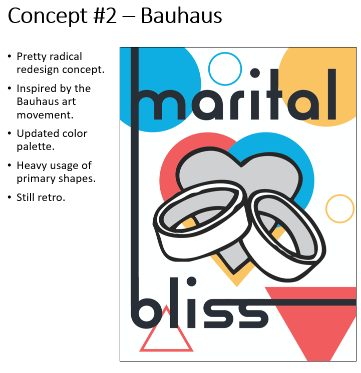
But for the update, I wondered if it was time for an overhaul. We felt like maybe that vintage style wouldn’t work any more, maybe we could go for something new? We spent a significant amount of time exploring options to completely rebrand the game.
Seeing what sticks
We created some super-rough ideas and started asking people for feedback. Most responses came from a few board game subreddits. The goal here wasn’t to land a final design, rather to quickly get some concepts in front of a broad audience and see how they were received.
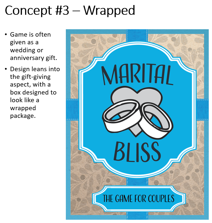
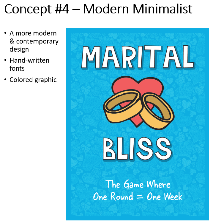
Surprisingly, the majority of people still preferred the original vintage design, with a smattering of others preferring and offering helpful comments about the other designs.
I should point out that this market research was far from scientific (but it WAS free!). The users of these subreddits aren’t necessarily our core demographic: our sales typically skew towards female buyers, and anecdotal experience tells me, the majority of members in those subreddits are male. Also, our game is lightweight and isn’t necessarily popular with the “hardcore” designers that frequent those pages.
However, the more popular subreddits like r/marriage… aren’t designed to help us gather that type of feedback, and actually forbid it. So I had to take what I could get.
On a positive note, at least one person on the boardgame design subreddit told me they owned and had played Marital Bliss, so I knew there was a least some overlap with my target market.
Narrowing the focus
For step two, after gathering the feedback and sifting through it (note, I also had to listen to my gut here regarding what was relevant and what wasn’t) Then, I got to work on reiterations, taking the concepts to a second, more polished state.
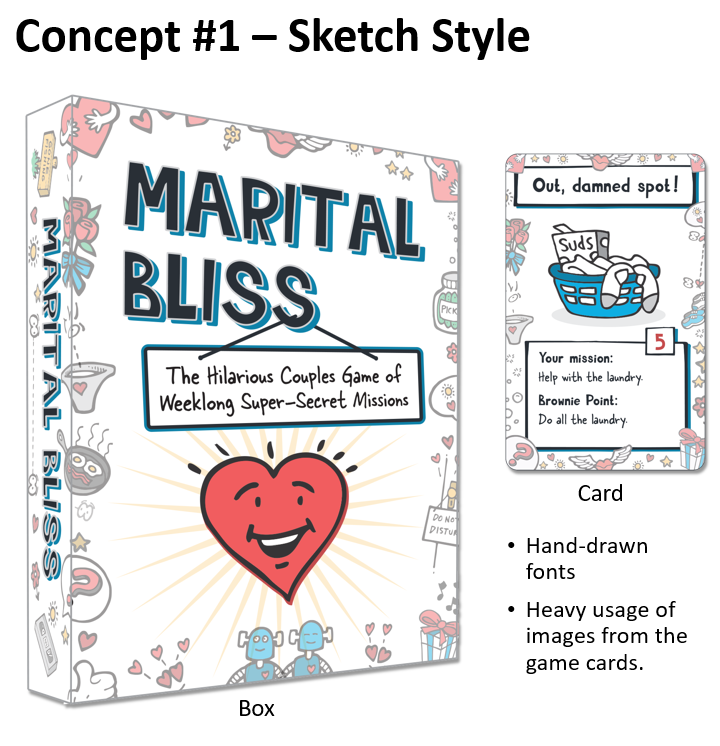
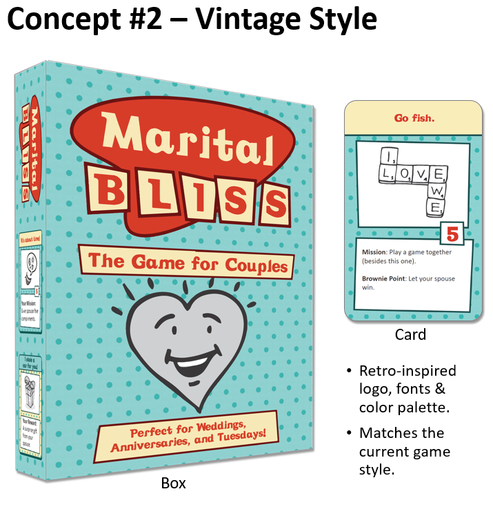
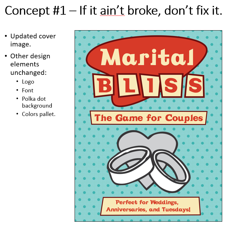
At this point, my personal preference was on a complete redesign, Concept 1 above. But, to my surprise, when I rounded up all the feedback… the original design was the overwhelming favorite. The people had spoken, the original design was the favorite… This is the point in time when Nicole and I realized we could’ve saved A LOT of time and effort and just stuck with the original design with a few updates!
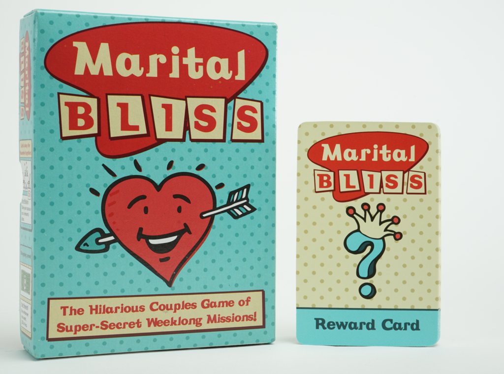
Joking aside, much of the feedback I received was valuable. For example, someone rightly questioned why I was insisting on using black-and-white imagery on the cover. Additionally, the sporadic design elements of Concept 1 ended up making it onto the interior of the box of the new version. A picture of the final redesign is below.
What do you think? Would you have preferred one of the other options above?
Our updates, your inbox
After subscribing, look for our confirmation email. If it goes to your junk or spam folder, add us to your safe senders list!
Recent Posts
- Where the Heck is Wall Drug?
- Gamification and Weight Watchers (aka Double Dub)
- Drift
- Anatomy of an Announcement
- Being Part of a Community vs. Building a Community
- Re-Release Part 4: A Redesign?
- Re-Release Part 3: Inclusivity
- Re-Release Part 2: Decisions to be Made
- Re-Release Part 1: Making Marital Bliss more Blissful
- What to do When Amazon Deactivates Your Seller Account